
![]()
The New York Times has a readership of 9.32 million. It’s a massive publication that most would be happy to be featured in. Major publications are looking for contributors that can add to their content creation, and the New York Times happens to be one of these publications.
I saw an article on international horse transport, you can read it here, and I thought to myself: how do you even get posted in the NY Times? And then I started to look at all of the articles on the site, featuring hundreds of contributors, and wanted to figure out how the average person can be published in the New York Times or any other large publication.
How are all of these people getting published?
Start Talking to Publishers Before You Even Write Your Piece
A major mistake that many first-time contributors make is that they write their piece first, and the next thing they know, they’re too late. It’s common to write a piece, spend days on it and then send it out to publications for approval.
If time-sensitive material is being written, it’s important that it be published as fast as possible.
Another content creator may beat you to the finish line and write on the same topic. At this point, you’ve wasted all of your time and energy on a topic that won’t be published on the New York Times.
Contact the publication with your idea beforehand. You’ll want to convince the publisher that your idea is one that they want on their publication. Op-Ed articles are accepted by the NY Times, so keep this in mind. You’ll need to do the following:
- Read the rules for sending in a topic suggestion if the rules exist publicly.
- Contact the editor using their name (very important).
- Pitch a topic idea.
- Sketch out your topic providing basic titles, headers of what you’ll discuss.
You’ll need to convince the editor that you have a unique angle for a topic and that you’re the right expert to cover the topic – very important.
Shoot for the 800-Word Mark
Longer content is being praised by editors because the word count allows for the topic to be discussed thoroughly yet succinctly. You’ll want to make sure that the content can be posted neatly into the platform, and while some people recommend sending an HTML post to the editor, you can also send a Microsoft Word document that has all the formatting in place.
I recommend staying within the publications guidelines if they have a word count limit listed.
Editors have very limited time, and it’s not uncommon for an editor to ignore a request if the word count is vastly over the limit. Because time is so limited, it’s best to shoot at the high-end of the word limit. Try your best not to surpass the limit.
Word count aside, there’s one important thing that you need to remember: the words on the page need to be anything but generic.
Controversial and Strongly Opinionated Content Works
Content needs to be meaningful. There’s a lot of content that has no real purpose. Editors seem to cling to pieces that are strongly opinionated or controversial. The New York Times, like every news outlet, needs to attract readers.
The reader is the only thing that matters and keeps the lights on.
When being controversial or making a strong stance on a topic, it’s important that you do so with headlines that are powerful. Draw in readers with a strong first sentence. Keep in mind that editors need the article to flow, with each paragraph forcing the reader to continue through the article to learn something new.
End paragraphs with strong hooks to keep the reader’s attention.
Seek Out Reporters
Don’t just focus on being published in the New York Times. If you have a good portfolio of content you’ve written and publications where you’ve been published, it will be easier to start writing for larger publications.
Help a Reporter Out (HARO) connects you with reporters and journalists that need to know information on a specific industry.
You’ll often obtain a link, and if you do get quoted, you can use this to your advantage to show the world your expertise. A lot of writers will have others mention their names or use their quotes on larger publications.
Why?
They can then use these quotes and the information they provide to start writing for the same publication. When contacting an editor, you can mention that you’ve lent your expertise to one of their reporters in a previous article.

 Are you in the event planning business? Event planning is a booming industry, and whether you organize a conference, fundraiser, seminar or just a simple party, social media is a beneficial tool to gain more attention and attendees. A huge advertising budget isn’t necessary to get people to show up since we’re now living in a world where social media is everywhere and as close as the nearest laptop. Here are ways to put your event in the spotlight using current technology.
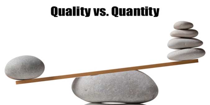 In this day and age, social media is the key to get the word out about a product or service. “Building a brand” is the sentence you will hear in meeting rooms all over the country. When building a base of followers and/or customers, is it better to have 1,000 people or just half that number or even fewer? Does quantity take precedence over quality? Not necessarily, because not all connections on social media platforms are equal. In the ongoing debate about quality vs. quantity, it’s better to strive for quality. Here’s why.
 Users of social media are realizing that larger networks are less
 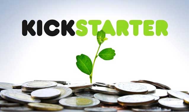 Launching a successful kickstarter campaign takes a lot of work. What is
  Trending topics, ranging from the death of a major celebrity to the latest baseball scores, get lots of people talking. There’s no denying the fact that social media is here to stay, and news stories are broadcasted around the world in just a few minutes. How can businesses use trending topics to become more visible and competitive? Timing is a critical factor because if a conversation ends, then whatever comment you post won’t be seen.
 If you look at the left hand side of your Twitter profile, you’ll notice a list of trends. This is what Twitter users are talking about at this very moment, and you can adjust the geographical parameters to match your location. Another way to see what’s hot right now is to click the “Discover” button at the top of the page.